Who doesn’t want their revenue charts trending upwards? Seeing that beautiful parabolic curve that moves up and to the right is what we all dream about at night, right? While we all want to see our bottom line grow, Mamoon Hamid, Co-founder and General Partner at Social Capital, demonstrates how looking a few metrics or calculations doesn’t provide the whole picture about the health of a company.
With his experience running a portfolio of dozens of SaaS companies, he’s seen how companies have fallen into the vicious cycle of filling a leaky bucket. The most important thing is to focus on is the underlying value your company delivers, not just MRR or the price of your product or service.
You can see Mamoon’s slide deck here.
And if you haven’t heard: SaaStr Annual will be back in 2018, bigger and better than ever! Join 10,000 fellow founders, investors and execs for 3 days of unparalleled networking and epic learnings from SaaS legends like Jyoti Bansal, Dustin Moskovitz, Jeff Lawson, and Michael Pryor. If you don’t have tickets, lock in Early Bird pricing today and bring your team from just $749! (All ticket prices go up September 1st.) Get tickets here.
TRANSCRIPT
Announcer: He coined the metric quick ratio at the first SaaStr Annual, which every top SaaS startup has gone on to put in their pitch decks. He’s led big rounds in Slack, Yammer, Intercom, Greenhouse, Box, and so many other iconic SaaS companies. Please welcome Mamoon Hamid, general partner of Social Capital.
Mamoon Hamid: Hi, everyone. It’s so good to be here with my people, the SaaS people of the world. Welcome. You know, as SaaS people, we dream about things at night that…This is what I dream about. I’m sure you all dream about the exact same thing at night, right? Don’t lie. Don’t lie.
It’s this perfectly parabolic curve that grows exponentially. You sell some. You expand some customers. You add some reps, and it just keeps growing, and growing, and growing and it makes this beautiful curve. This is all what we dream about, right? Well, this is someone’s reality. You may think it’s a very lucky company, but it’s actually a company’s dream that turns into a nightmare.
This is what we think about. It’s too damn high. Well, it’s not, actually. We like exponential growth. If we can keep it going forever, that’s great. We can go public and make lots of money for our investors. It’s not really that, actually.
Let’s go back to that company. We call it the Not So Fictional SaaS company. This is the first year of operations. It grows from zero revenue to about a million in revenue, which I think is a pretty good outcome for a SaaS company. It grows 33 percent a month for the first year. We should be pretty happy about that kind of growth.
Let’s break it down into the sum of the parts which is the new revenue, the expansion revenue, the churn revenue, and then some contraction revenue. It looks pretty good, right? I think we’d all agree that this is what we’d expect to see from a SaaS company in its first year of operations. We start to see some yellow. The yellow is early customers who decided that they didn’t like the product, or something or the other. Maybe some lookie loos or something of that ilk.
Then we look at the next thing, which is our beloved quick ratio. I think many of you may know about the quick ratio. We coined it at this conference two years ago. We see that this quick ratio sort of starts to hover down to four, on this logarithmic graph here. For those of you who don’t remember what a quick ratio is, I’ll quickly define it. What this really means is that for every four dollars of revenue that we’re adding, we’re losing about a dollar of revenue in that given month.
Just to define the quick ratio again, it’s brand new revenue from new customers. You add to that expansion revenue from existing customers and you divide that by customers that you’ve lost or customers that have contracted…quick ratio. A bunch of data suggests that a quick ratio of four, is quite desirable, four or above. That red line indicates this quick ratio of four. It looks like our Not So Fictional company stays above that ratio of four, which is really good.
Then let’s look at the next thing, which I think all of us look at, which is churn. Here, we see that this company has some choppy churn up in the beginning. The blue is the gross churn. The orange is the net churn. We like companies that have negative net churn, which is what this company still has. I wouldn’t read into it too much. It’s early days and churn really doesn’t show up until later. Maybe some warning signs.
Let’s recap this company. It’s gone from zero to a million in revenue. Pretty good. It’s mostly organic growth, probably zero, or maybe one salespeople, or you as a founder are the salesperson. It’s got this quick ratio that’s hovering around four, which is pretty good. Then you’ve got negative churn. Check, check, check, check, check. Series A likelihood, greater than 90 percent. It’s very scientific.
Now, let’s play this out. Let’s go to year one through three. We’ve charted the first 12 months on a three year scale. You already saw these numbers. Now, let’s plot out year two and three for this company, Not So Fictional.
Whoa! Look at this. Wow, that’s nice. That’s the dream, 9 percent growth for the next two years. Parabolic exponential…beautiful, looks great. We’re on fire. You’re ready to go raise your Series B. You can count the money in the bank. The $25 million Series B you’re going to raise from Byron at Bessemer. Right, no…? Hey, Byron.
Then let’s break it down further. We start to see a lot of yellow. It’s churn. Churn is showing up. It’s customers who don’t like our product, they don’t find use in it…something. It’s a lot of yellow there. Still, there’s a lot of blue and a lot of orange. Looking at this chart, I think that things are pretty good.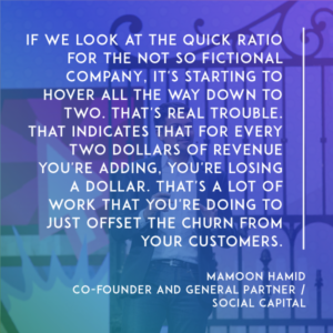
But if we start to look at the quick ratio, it’s starting to hover all the way down below that four, and down to close to two. That’s trouble. That’s real trouble. That indicates that for every two dollars of revenue that you’re adding, you’re losing a dollar. That’s a lot of work that you’re doing to just offset the churn from your customers.
For early signs of trouble, let’s look at churn. Churn indicates, again, gross churn is going up and we’re no longer in the negative net churn territory. To recap, this Not So Fictional SaaS company has gone from a million in revenue to nine, which is spectacular. All of us would want that. We would fund it if you showed us these numbers. It also took you 20 salespeople, a lot of work. You had to hire them, like half of them didn’t work out, and they didn’t attain to their quotas…
It took about 20 salespeople to get to this 20 million in revenue. Then you had this expansion revenue, which was offset by the yellow, the churned revenue. A bunch of customers weren’t all that happy with your product or they just didn’t find value in it…something happened, and that’s not good. You saw that because of that, the quick ratio started hovering close to two, which is problematic.
We saw the churn charts started to trend in a place where they don’t look that good. Worst of all, we’re burning about a million dollars a month to achieve this type of growth. The million dollars a month comes from 20 salespeople, lots of engineers, the gross margin on nine million on revenue…You net it all out and you’re at about a million a month of burn.
The top line would indicate very fundable company. The bottom line, and the actual underlying metrics, suggest that we have a problem. We have a leaky bucket problem. We’re losing more customers faster than we’re able to add customers on the top. The only reason why we’re able to survive is because we have some customers who are expanding as well.
How do we make sense of this? How do we actually get down to the bottom of the root cause of what’s going on in this Not So Fictional company? What we’ve failed to do is actually look at the product market fit of our service. We haven’t really gotten down to why people use the product that we’re selling to them. We have to look at churn expansion, and contraction of MRR, as actually just a lagging indicator of success or failure.
We should be looking at something very different. Why are people using the product we’re selling to them? We have to find the leading indicator of success or failure. For that reason, we all have to think about this…You have to find your North Star. Your North Star is something that is underlying to the product and the service that you’re delivering. It’s really important to get to that North Star.
We’ll talk about some of the things that you could find in your product that are your North Star, and I’ll provide some examples in just a minute.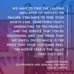
MRR, the thing that we dwell on so much, is the price that your customer pays. The North Star is the value that they get. It’s a measure of the value that you deliver. Think hard about what your North Star is. Even just now, just start thinking about that North Star. Many of you may already have something in mind that measures true value from your service.
Maybe I’ll go into some examples. This is a particular North Star, for a particular company that exists out there today. It’s daily active use, to monthly active use…The ratio between the two, how many users that come to your service monthly actually use the product on a daily basis. Here’s a company, it’s not a fictional company, it’s a real company, it has this daily active use that hovers between 45 and 50 percent.
Then it’s got these big troughs, these big valleys. We’ll talk about why this company has valleys.
To give you some perspective, here’s a company, that we all know about, it’s worth about $400 billion, it used to have a DAU to MAU of 55 percent up until 2012, now it’s actually jumped up to 65 percent in the last five years. Just to compare apples to apples, of the first three years of this other company, with the choppy DAU to MAU, I provided sort of a leveling of 55 percent.
Can anyone guess what this company is?
[background conversation]
Mamoon: You’re right. [laughs] No mystery here. The reason why there’s valleys is because there’s the holidays and people don’t work during the holidays. It clearly shows up in the Slack data.
Wait a second, I actually have another company I want to put up here. Here’s a company that also has a DAU to MAU metric that it uses as its North Star. Any guesses here, what this could be? Any guesses…? It’s also a SaaS company, originally out of France, the founder will be here talking later today…?
It’s a company called Front. It’s a shared inbox app that brings all external messages email, text, Twitter, Messenger, into one unified inbox where your colleagues can triage those messages, assign them to each other, respond to those messages…and because it’s email, and it’s messages, it’s a daily active use product. People use this product to get their job done. They use it every day to be productive, to solve customer issues, solve external issues.
If Slack is for internal communication, then we look at Front as being the service for external communication. Here you look, and it’s got this off the chart DAU to MAU…jumped up after the holidays, hovering around 65 percent, and Slack not too shabby at 55 percent…Two pretty spectacular DAU to MAU.
This doesn’t have to apply to your company. You may not have a DAU/MAU business. You may have a files previewed, or files downloaded, or you’re a security company…You have some other North Star metric. That’s how to think about your North Star. It’s the value that your product is delivering.
What’s a good North Star? Bad ones are MRR and paid seats. It doesn’t tell you about the value that you’re delivering. Good ones are things like DAU/MAU, messages sent…but they’re really bulk metrics. Better ones are beyond that, that even test your product market fit in even a better way…The number of messages sent within 30 days of sign up, or an L28 chart that shows if you were in the product for 16 days out of the 28 days.
Here are some examples of some other North Star metrics, of other companies that are in the Social Capital portfolio. Box, you all know Box…number of file actions. Intercom, a lot of you probably know about this company…number of customer interactions. ClearSlide, pitches viewed. Greenhouse, a recruiting software…hires made. OneLogin, single sign on, number of apps signed into per DAU. Netskope, security company…number of apps monitored per user.
Again, you can vary your North Star, obviously, based on the business you have. You can also evolve your North Star metric over time. What may be relevant to Slack three years ago, as the DAU to MAU, may be actually a much more different metric that’s important to them now. They’ve checked that box.
Now, it might be a much more refined view on what’s important to Slack today to grow from the big company that it is, to being a behemoth. It may be a different North Star, actually.
To recap, the North Star is all about the value that you’re delivering and making sure that it’s greater than the price that your customer pays. Focus on that. That’s how you will find your North Star.
So let’s go back to our Not So Fictional SaaS company. Let’s see what happened over time. We saw this chart. Zero to one million, pretty awesome. Up to 10 million in three years, really great.
Then let’s start looking at what happened after that. This is what happened. It grew, but then it plateaued. It added MRR, but then it also lost a bunch. We can see that in this next chart, where this yellow just started to dominate…Yellow and gray. Contraction and churn revenue started to dominate, which showed up here in the churn. This churn is kind of deceiving.
If you look at it, really the gross churn is one to two percent, and the net churn is between zero and one percent. That’s because the denominator, which is the total ARR, makes those numbers seem pretty small. That’s why later in life this churn can be quite deceiving. You might say, “Our monthly churn is 1.5 percent.” But that’s really, at this stage of a company, not that relevant.
What is relevant, though, is looking at the quick ratio. Here you see that the quick ratio is very quickly coming down to one. What that means is for every dollar revenue, you’re losing a dollar of revenue. You’re pretty much in a treadmill. You’ve like fully fulfilled that leaky bucket promise that we talked about and fulfilled that dream that turned into a nightmare.
What does this mean? Your new revenue is barely making up for your churned revenue, which means that you’re not going to be able to raise money. You’re going to make sacrifices, which means that you’re not going to build the product you need to stay competitive. Less competitive product means more churn, and people will leave your company…They’ll go to the next best SaaS company.
You enter this vicious cycle. This is the problem that we see a lot of companies facing, is that you get to this point and you’re at the vicious cycle. You forgot where you came from, which is like you led with product. You led with the North Star. Don’t become one of these companies. Instead, do this…
Thank you.